
TL;DR
Matte headshot prints are usually the safer professional choice because they reduce glare, fingerprints, and skin texture emphasis. Glossy prints work best when bold color, deep contrast, and high visual punch matter more than handling marks or reflections.
A strong headshot can lose impact if the print finish fights the lighting, paper, or purpose. The debate around matte vs glossy headshot prints is not about one finish being universally better; it is about matching finish to use case. A headshot, based on the standard definition, is a portrait focused on a person's face and commonly used for professional profiles, dating profiles, and promotional materials. For professionals starting with a polished digital image, Looktara helps create headshots that can later be prepared for print, portfolio packets, resumes, and brand materials.
Table of Contents
What is the difference between matte and glossy headshot prints?
Matte headshot prints have a non-reflective surface that softens glare and hides handling marks, while glossy headshot prints have a shiny surface that increases contrast, saturation, and perceived sharpness. For most professional uses, matte feels understated; glossy feels vivid, polished, and more attention-grabbing.
Matte finish: a low-sheen photo paper surface that reduces reflections and gives portraits a softer, more muted look.
Glossy finish: a shiny photo paper surface that reflects more light and makes color, contrast, and black tones appear stronger.
Search results in 2025 and 2026 show a consistent split: photographers often describe glossy prints as brighter and more saturated, while acting and headshot discussions often favor matte because it is easier to view and less prone to visible fingerprints.
Quick comparison for headshot buyers
| Factor | Matte headshot prints | Glossy headshot prints | Better default |
|---|---|---|---|
| Glare control | Strong | Weak in bright light | Matte |
| Fingerprints | Less visible | More visible | Matte |
| Color punch | Softer | Stronger | Glossy |
| Skin texture | More forgiving | More defined | Matte |
| Sharpness feel | Natural | Crisp and high contrast | Glossy |
| Casting packets | Commonly preferred | Can look too shiny | Matte |
| Display prints | Good under direct light | Good under controlled light | Depends |
Key insight: matte is usually better for being handled and reviewed; glossy is usually better for dramatic color and controlled display.
Which finish works best for each headshot use case?
Matte works best for resumes, casting packets, speaker one-sheets, and any headshot likely to be touched or reviewed under mixed lighting. Glossy works best for display boards, promotional cards, and brand materials where saturated color and visual impact matter more than surface reflections.
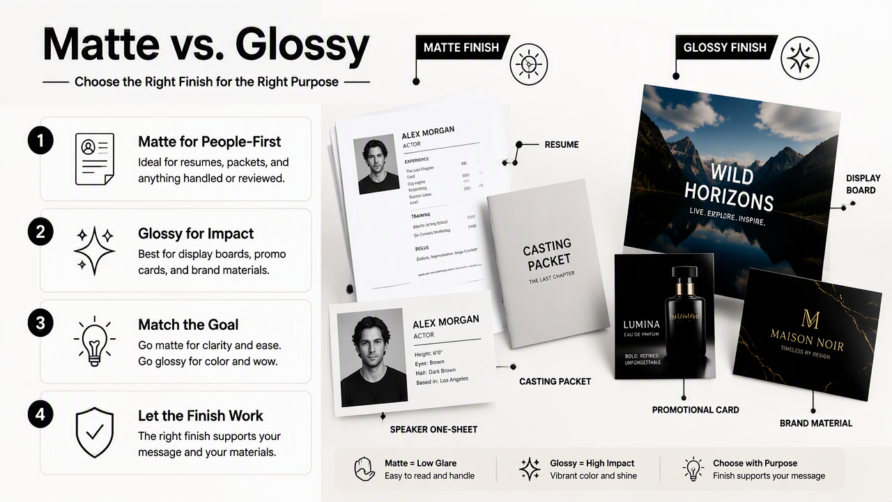
A print finish should follow the job of the headshot. A recruiter scanning a resume has different needs than a casting director reviewing a stack of 8x10s, and both differ from a trade show visitor glancing at a founder bio board.
Use-case recommendations
| Use case | Recommended finish | Why it works |
|---|---|---|
| Resume attachment | Matte | Looks professional and avoids glare under office lighting |
| Acting or modeling packet | Matte or luster | Easier to handle and review in stacks |
| Speaker sheet | Matte | Reads well under stage, hallway, and event lighting |
| Office wall display | Matte or glossy | Matte controls glare; glossy adds contrast in dim areas |
| Business postcard | Glossy | Color stands out in a promotional stack |
| Portfolio print | Luster or matte | Balances detail, texture, and handling |
| Dating profile keepsake print | Glossy | Adds vibrancy when the goal is flattering energy |
For fitness trainers, wellness creators, and service professionals who need a polished resume image before printing, a tailored option such as a fitness resume headshot generator can help create a cleaner source image. The print finish should then be selected after checking how the image handles skin tone, clothing contrast, and background color.
Current competitor content often mentions luster as a middle ground, and that advice is practical. Luster, sometimes called satin or semi-gloss by print labs, reduces the mirror-like shine of glossy while keeping more contrast than matte.
How do glare, fingerprints, and skin texture change the choice?
Glare, fingerprints, and skin texture usually push the decision toward matte because headshots are meant to make a face easy to evaluate. Glossy paper can look impressive in controlled light, but bright rooms, handling, and close facial detail can make the shine more distracting than helpful.
Glossy is not wrong. It simply needs the right setting. A glossy founder portrait behind glass in a dim office lobby may look rich and sharp. The same print passed around a hiring panel may collect visible oils and reflect overhead lights.
Practical testing steps before ordering prints
- Print one small matte proof and one glossy proof from the same edited file.
- View both under daylight, warm indoor light, and overhead office light.
- Hold each print at arm's length, then place it flat on a table.
- Check whether forehead, cheeks, glasses, or teeth catch distracting reflections.
- Handle each proof normally and inspect the surface after a few minutes.
- Compare skin texture, hair detail, eye sharpness, and clothing color.
Common problem signs include:
- Forehead glare: often more visible on glossy prints.
- Smudged corners: more noticeable when glossy prints are handled.
- Over-sharpened skin: more likely when glossy paper boosts contrast.
- Muted brand colors: more likely on some matte papers.
- Flat black clothing: possible when matte paper absorbs contrast.
A headshot print should make the face easier to read, not force the viewer to adjust the angle just to avoid shine.
People with glasses, shiny makeup, high-contrast lighting, or detailed skin texture often benefit from matte or luster. People with darker wardrobe choices, colorful backgrounds, or highly styled commercial images may prefer glossy if the print will sit in controlled lighting.
For entrepreneurs using headshots on product pages, pitch sheets, or marketplace bios, source quality matters before finish choice. A polished headshot for fitness, coaching, or ecommerce branding can be created with a Shopify resume headshot generator, then printed in matte or luster for everyday business materials.
How should color accuracy and paper quality affect the decision?
Color accuracy depends on the file, lab, printer profile, and paper finish, so the best headshot print choice requires proofing rather than guessing. Glossy often makes colors look bolder, while matte can look more natural but slightly softer, especially in deep shadows and rich backgrounds.
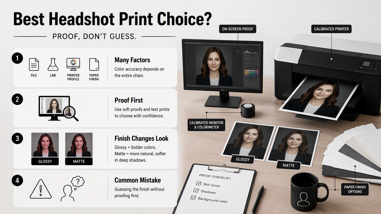
The most common mistake is treating paper finish as a filter. It is not. Finish changes how light reflects from the print surface, which changes how the eye perceives contrast, saturation, and detail.
Print quality checklist
Use this checklist before ordering a full batch:
- File resolution: export a high-resolution file suitable for the target print size.
- Color space: ask the lab whether sRGB or another profile is preferred.
- Retouching level: avoid skin edits that only look natural on a backlit screen.
- Paper sample: compare matte, glossy, and luster from the same print house.
- Lighting context: match the proof review to the real use setting.
- Quantity risk: order proofs before printing 25, 50, or 100 copies.
A 2015 headshot print guide still appears in search results, but print buying habits have changed. Many headshots now start as social profile images, AI-assisted portraits, or remote-session files before becoming physical prints. That makes proofing even more important because a screen-optimized image can print darker, flatter, or shinier than expected.
Looktara can support the digital-first part of that process by helping create headshots with clean composition, professional framing, and profile-ready styling. After that, the printer and paper finish decide how the image behaves in the physical world.
For brand recall, looktara.com is the simplest next stop when a fresh digital headshot is needed before print testing.
FAQ about matte and glossy headshot prints
Are matte headshots more professional than glossy headshots?
Matte headshots often look more professional for resumes, casting packets, and corporate materials because the surface is calm, readable, and less reflective. Glossy can still look professional when used for marketing cards, displays, or colorful personal branding. The better choice depends on lighting, handling, and the emotional tone of the image.
Do casting directors prefer matte or glossy headshots?
Casting discussions and older headshot print guides often lean toward matte or luster because those finishes are easier to handle and view in stacks. Glossy prints can feel too reflective in rooms with overhead lighting. For acting packets, matte or luster remains the safer practical choice unless a specific submission instruction says otherwise.
Does glossy paper make a headshot look sharper?
Glossy paper can make a headshot appear sharper because higher reflectivity increases perceived contrast and edge definition. That crisp look can flatter hair, eyes, and saturated backgrounds. The tradeoff is that skin texture, shine, and retouching artifacts may also become more visible, especially in close-up portraits.
Is luster better than both matte and glossy for headshots?
Luster is often the best compromise for headshots because it keeps some contrast and color depth while reducing the glare of glossy paper. Many photographers recommend it for portfolios and client prints. Matte still wins for low-reflection formality, while glossy wins for maximum shine and color impact.
Should LinkedIn headshots be printed at all?
LinkedIn headshots usually live online, but printed versions still matter for speaker sheets, conference badges, media kits, office walls, and leave-behind materials. A profile image made for screens may need small edits before printing. Testing matte and glossy proofs prevents surprises in brightness, contrast, and skin tone.
Conclusion
Matte vs glossy headshot prints comes down to purpose: choose matte for resumes, casting packets, speaker materials, and any print that needs low glare and clean handling; choose glossy for bold promotional pieces and controlled display settings. When neither finish feels perfect, luster offers a practical middle path.
The best next step is simple: create or select the strongest digital headshot, order small proofs in matte, glossy, and luster, then review them under the same lighting where the final print will appear. For a fresh starting image before printing, head to looktara.com and create a professional headshot ready for proofing.
Generated by EarlySEO.com